Working preview. Nothing here is final. Some copy, imagery, handles, and pricing are placeholders. Prepared for internal and investor review only.
Launch preview · design & messaging
Don't take a chance. Make the change.
A look at where the Change launch is heading: the story we're telling, the creative telling it, the doctors backing it, and the machine we're building to test, learn, and scale it. Directional, not final. Built to show flavor and trajectory.
The activation arc
Warm the audience before the product ever says hello.
Everything below runs on one idea: by the time a parent sees a Change diaper, she should already understand why the diaper she's using is the problem. We build the audience first, then launch into it.
1
Seed the problem
Unbranded awareness content raises the question no one asks: what is actually inside a disposable diaper? Every view builds a retargeting pool of parents who now want the answer.
2
Read the Label
Branded warm-up on Change's own channels. The "Read the Label" and "Permission to Quit" lanes teach the category story in Tom's voice while the ad account itself warms up.
3
Launch into warmth
Ecom goes live and paid social leads the first wave. Retargeting sequences move the warm pool from problem, to how it works, to product, to offer.
4
Scale what wins
Winning angles and formats graduate to bigger budgets and new channels, with broadcast layering in behind the digital foundation.
The message, in order
Six ideas, one hierarchy.
Every ad, page, and script below draws from the same stack, in the order Tom set it.
Performance. It stays dry.
The engineering leads. Liquid leaves the skin fast and stays away. This diaper competes on performance first, values second.
Rash has a reason.
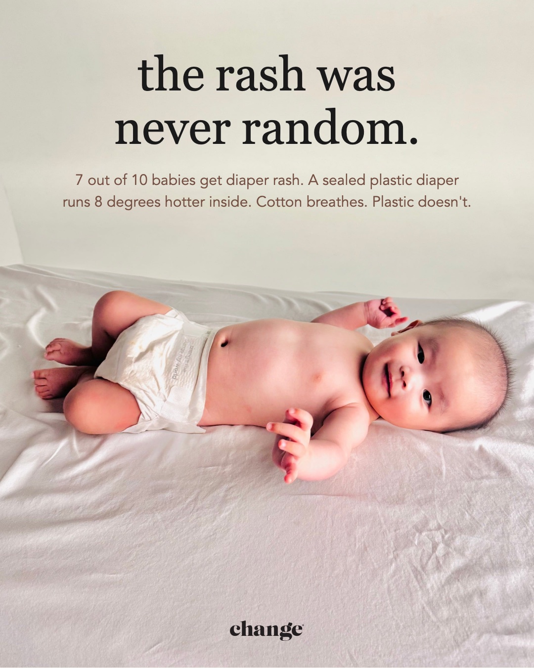
It was never random. Sealed plastic, heat, humidity, and what leaches back onto skin. Naming the cause is the category's untold story.
Cotton, every layer.
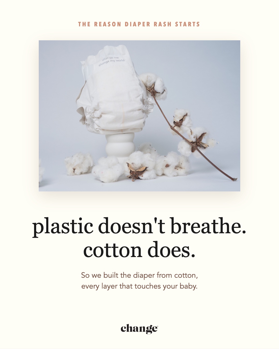
Top sheet, back sheet, leg cuff. Not a cotton liner with plastic everywhere else. We are cotton.
The bio-SAP.
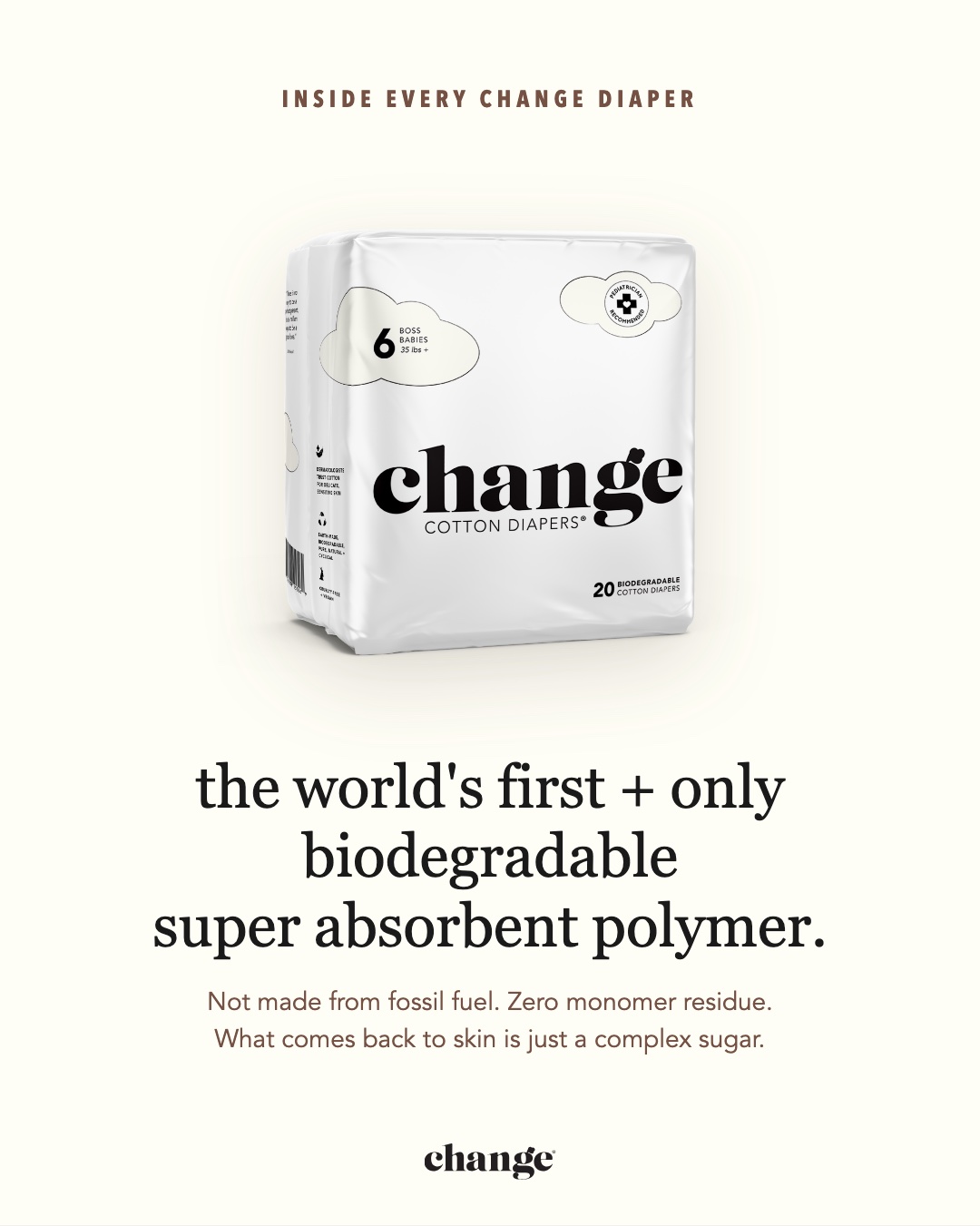
The world's first and only biodegradable Super Absorbent Polymer. We built it, and nobody else has it.
Since 1961.
Diapers went plastic in 1961 and never went back. There was no other choice. Until now.
The movement.
The spine line that closes everything: an invitation, not a lecture.
"Don't take a chance. Make the change."
Paid social · awareness creative
The ads that teach the category story.
Two working sets, built on the Change design system. "Read the Label" runs the problem and the reveal. The product set carries the rash story and the performance claims in Tom's own words. Type stand-ins and placeholder handles for now; final brand type lands in the hi-fi pass.
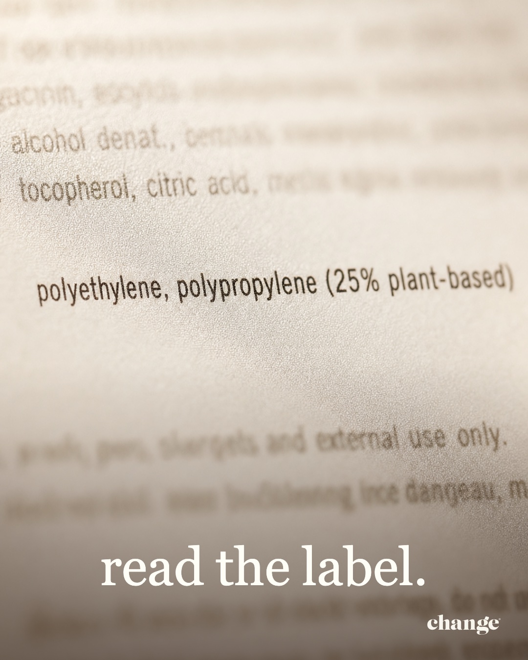
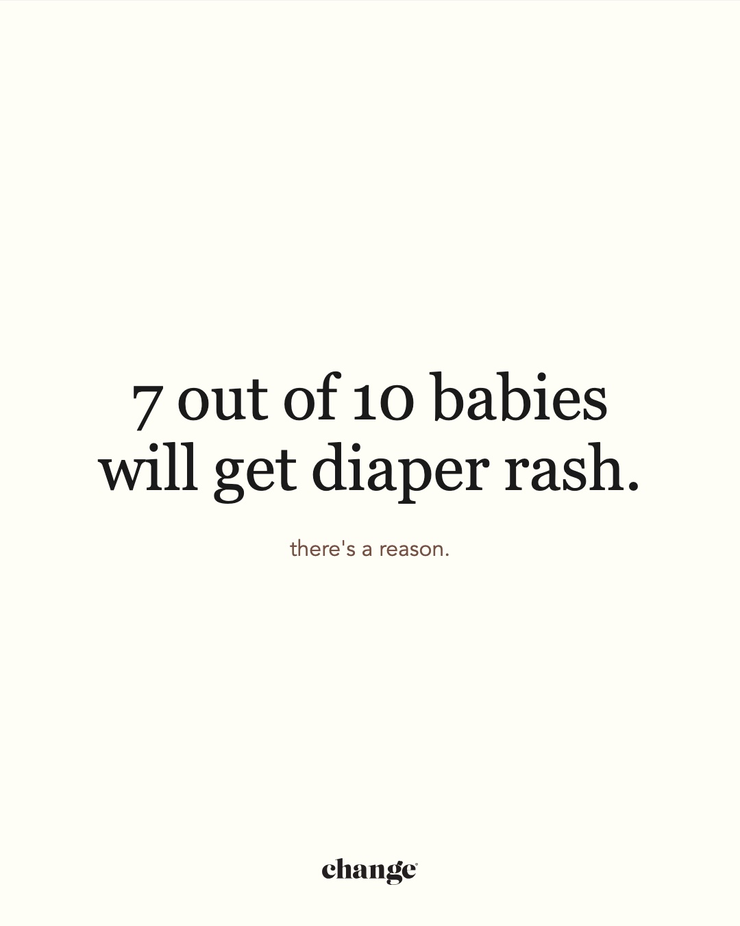
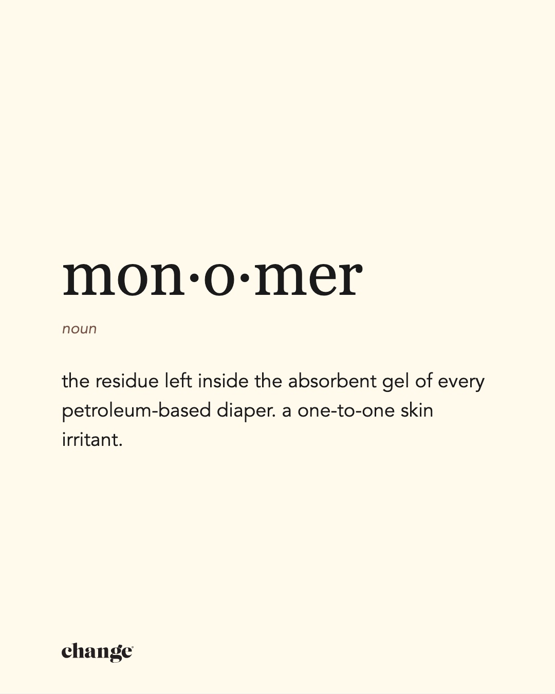
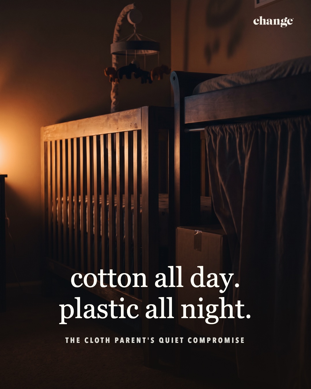
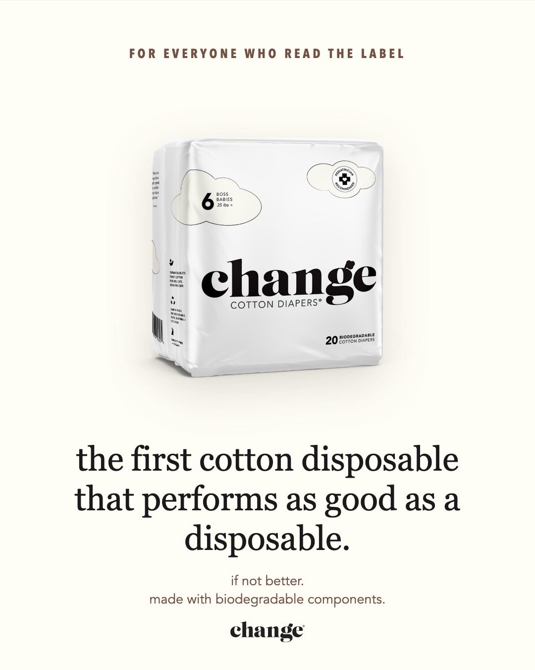
Read the Label · the fine printRead the Label · one cup of crude oilRead the Label · 7 out of 10Read the Label · the definition cardRead the Label · the cloth parent's compromiseRead the Label · the reveal (runs last)Product set · the rash was never randomProduct set · plastic doesn't breatheProduct set · the safest, softest diaperProduct set · first and only
The ad rooms show every unit in a live Facebook and Instagram mockup, with full captions. The carousel swipes.
The proof engine
The pediatricians back every claim we make.
A named team of practicing pediatricians, each on camera in their own words. Doctor content runs as organic proof, paid creative, and the trust layer of the site. Working edits below.
Dr. Barbara VinciDr. Alison LevineDr. Nitin Gupta · approved cut
Organic social
The feed carries the same story.
Carousels and stories from the working organic calendar. Same hierarchy, same design system, built for saves and shares rather than clicks.
We Need Change
Diaper Hours
Meet the Pediatric Team
The web experience · in progress
Where the story converts.
Structural build of the launch site: homepage, product page, and the pediatric team page. This is the working skeleton with live copy; photography, final type, and the hi-fi design pass are in flight with the design team now. Grey boxes are reserved photo slots. Pricing shown is placeholder.
changediapers.com
Homepage: performance-first hero, the 1961 story, rash explainer, doctor band, subscription offer.
changediapers.com/diapers
Product page: the material is the product. Cotton macro leads the gallery.
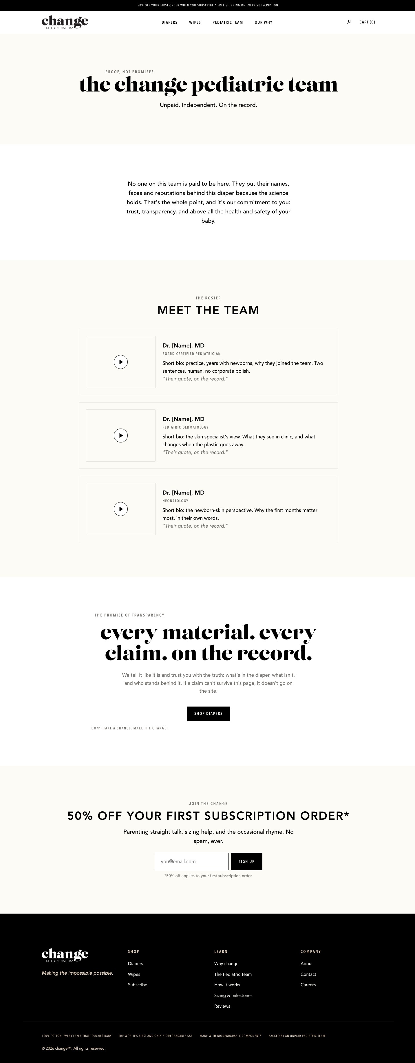
changediapers.com/pediatric-team
Pediatric team: headshots, video, and a featured quote per doctor. The proof page.
Each window scrolls. These are working greybox builds, not final design.
The performance mindset
Every ad is a test. Every test buys knowledge.
We don't launch a campaign and hope. We launch a testing system and let the audience vote with attention and orders.
Angles before budgets
Rash, performance, ingredient truth, cloth-parent relief, founder story. Each angle enters the account as a small structured test before it earns spend.
Visual response first
Multiple visual treatments per message find which frames stop the scroll. Winning treatments become the design frameworks the next round of messaging iterates inside.
Kill fast, scale winners
Clear decision rules per test: losers come down quickly, winners graduate to bigger audiences, new formats, and eventually broadcast. The creative library compounds.